Synchronized Studio
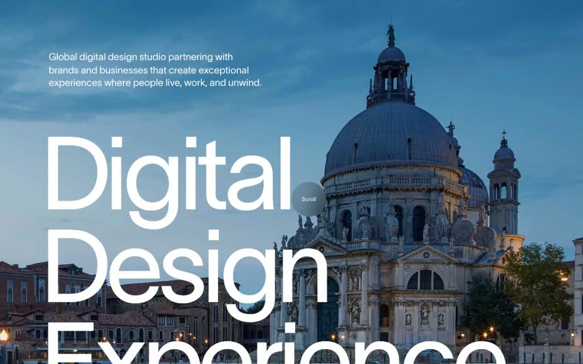
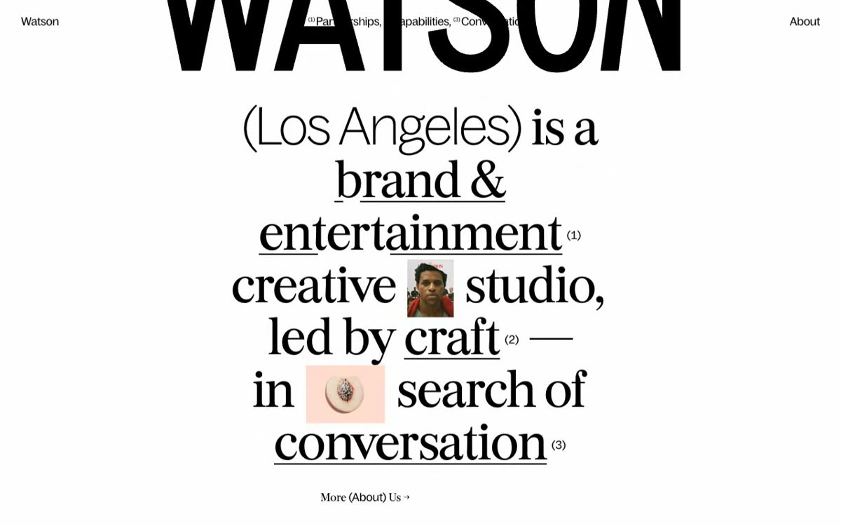
Digital studio site in pure black, with a counter opening and numbered cases on light cards
Steal this
Split an intro sentence and scatter the pieces across the screen corners as a counter climbs
What it is
The opening is a counter up to 100 with the line "We Are Synchronized All About Digital Experiences" scattered across the corners of the screen. Then the cases come as numbered light-gray cards, with a big condensed serif title and a black-and-white photo, like Canary Islands x Expedia.
What it’s for
For an art director building a studio site who wants to show projects like magazine pages on a dark background.
Benefits
- numbered cases that are easy to scan
- strong contrast between black background and light cards
- big type that works as illustration
Caveats
- It is a studio site, so it works as inspiration, not as a tool.