UI components
Component libraries and single components you can drop into a product: buttons, menus, cards, backgrounds and text effects, many of them animated. Each card shows it working and says what to borrow.
39 references · Updated
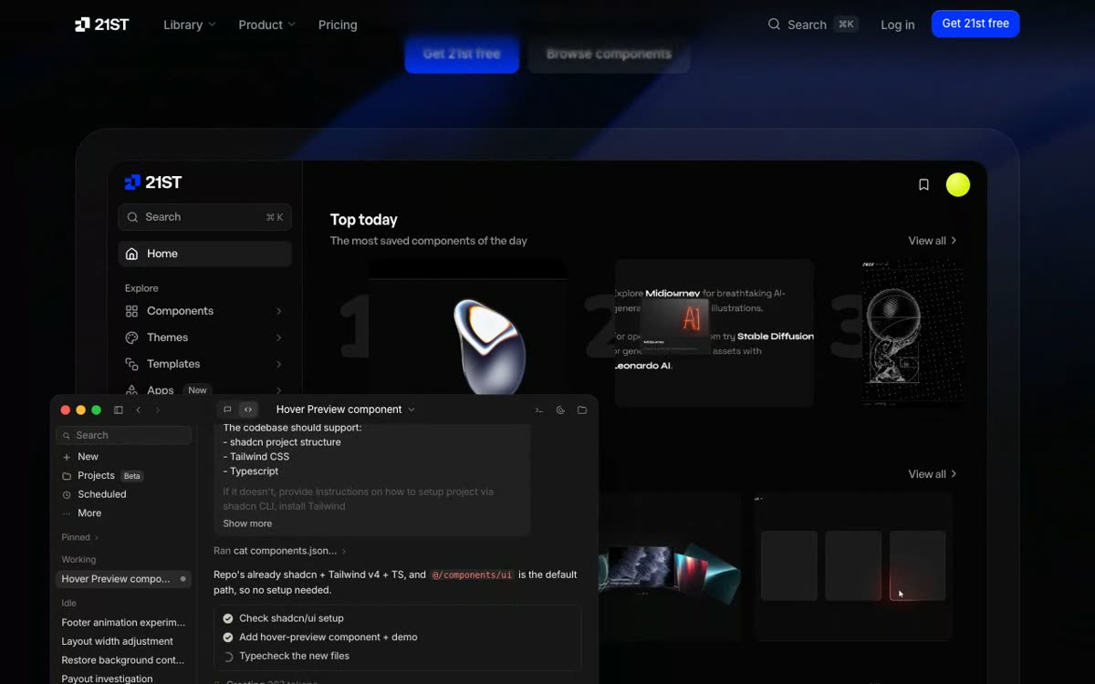 21st.devUI componentsCommunity React components, themes and templates you copy through the shadcn CLI or a ready prompt.
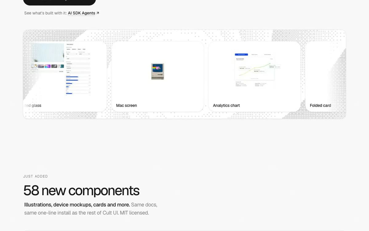 Cult UIUI components154 animated components for shadcn/ui projects, free and added with a single command.
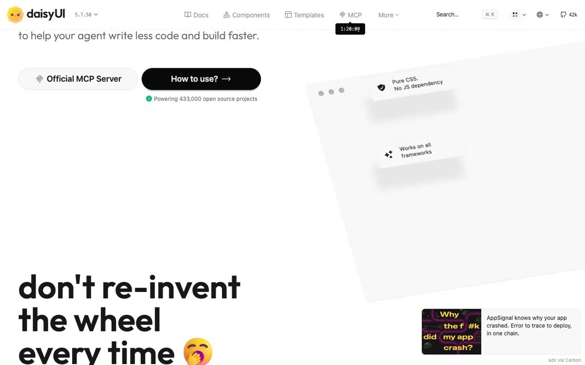 daisyUIUI componentsSemantic Tailwind classes like btn, card and toggle, so markup stays short and themes swap easily.
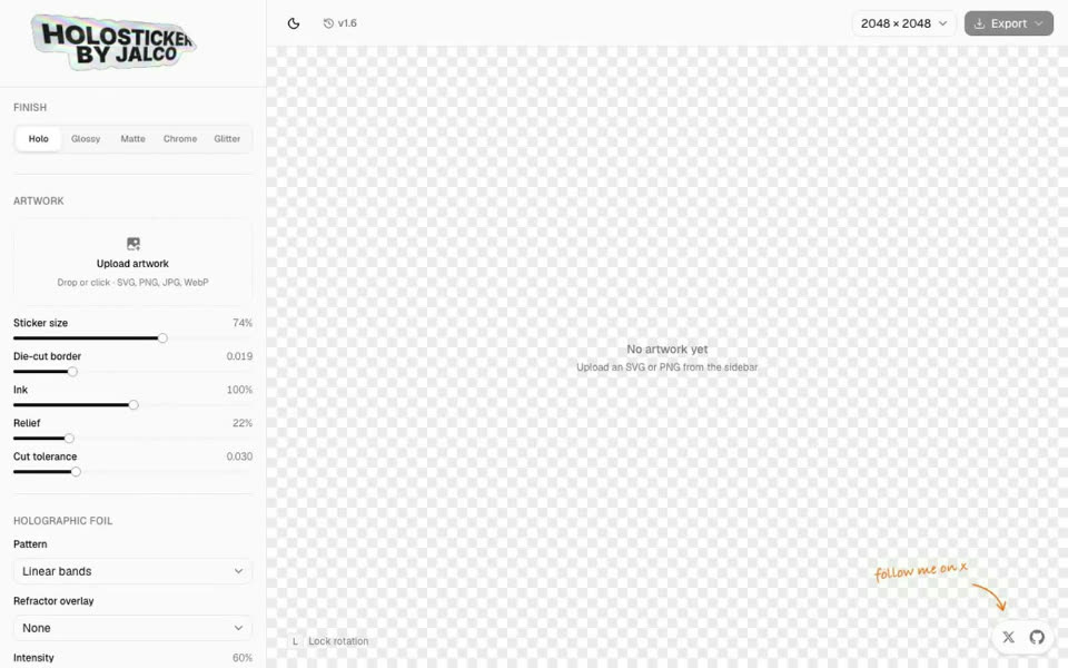 HolostickerUI componentsDrop in artwork and get a holographic foil or chrome sticker with a peeling corner.
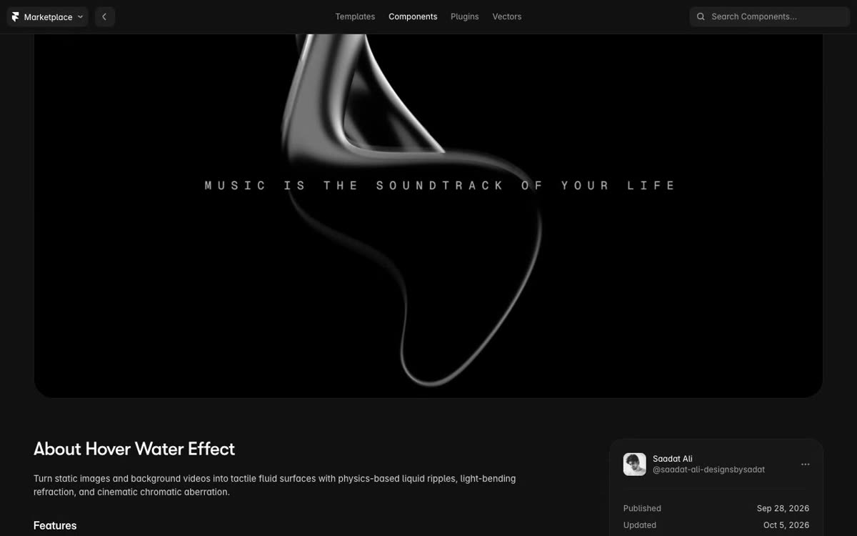 Hover Water Effect (Framer)UI componentsA liquid chrome shape that reacts to the cursor, over a centered line of spaced mono text.
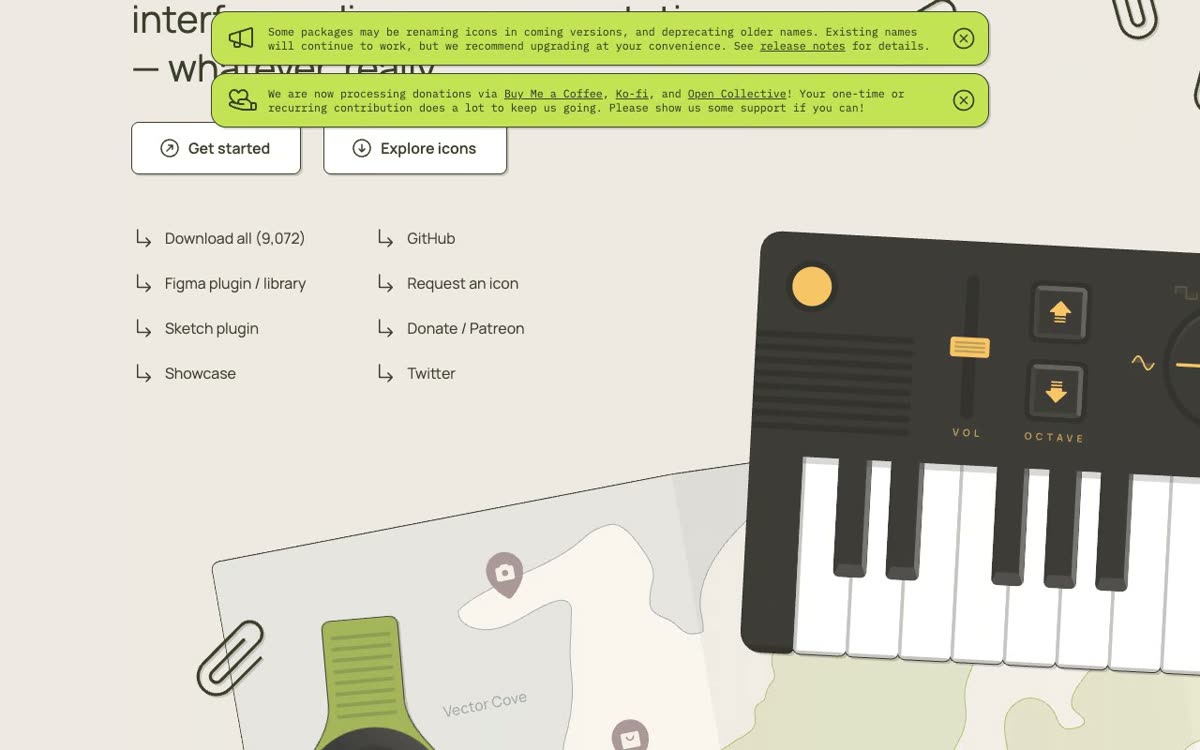 Phosphor IconsUI componentsOne icon family in six weights, from thin to duotone, with Figma and Sketch plugins.
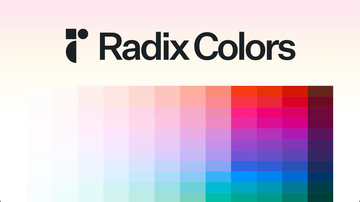 Radix ColorsUI componentsColor scales in light and dark pairs, with steps assigned to backgrounds, borders and solid fills.
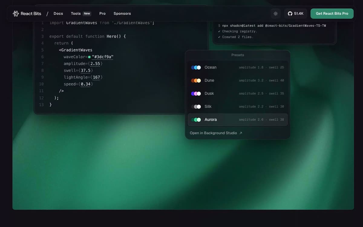 React BitsUI componentsAnimated text, backgrounds and microinteractions you copy into a React app as source and tweak.
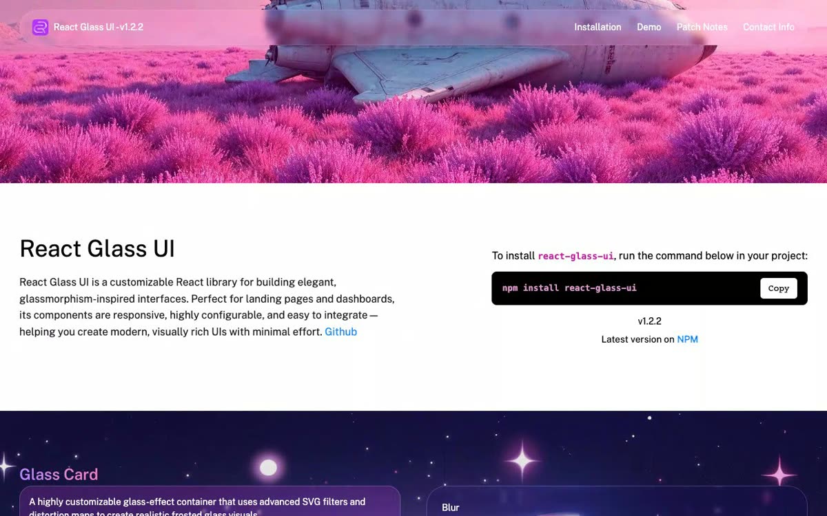 React Glass UIUI componentsGlass cards, buttons and inputs as React components, with blur, glow and hover you can tune.
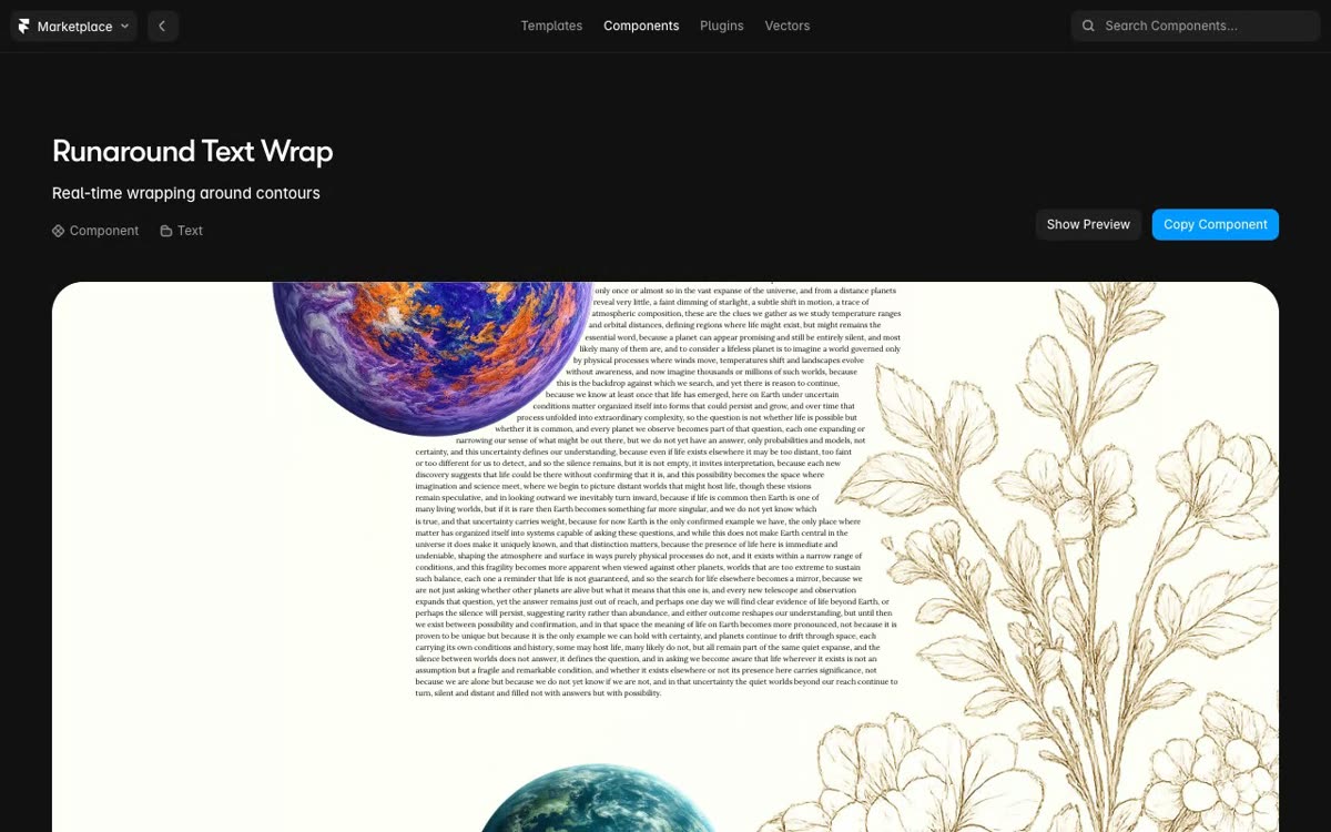 Runaround Text Wrap (Framer)UI componentsBody text that reflows around a moving image, hugging the outline of the shape.
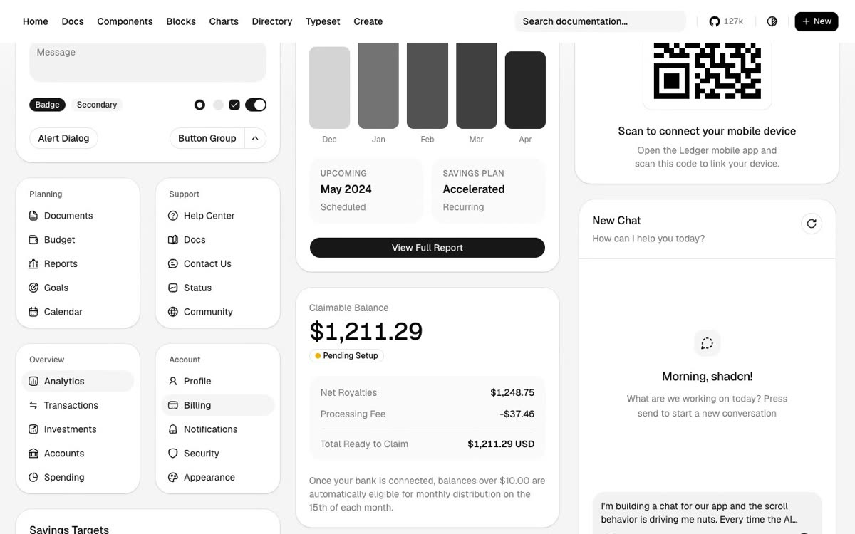 shadcn/uiUI componentsComponents whose code you copy into your repo and edit, as the base of your own design system.
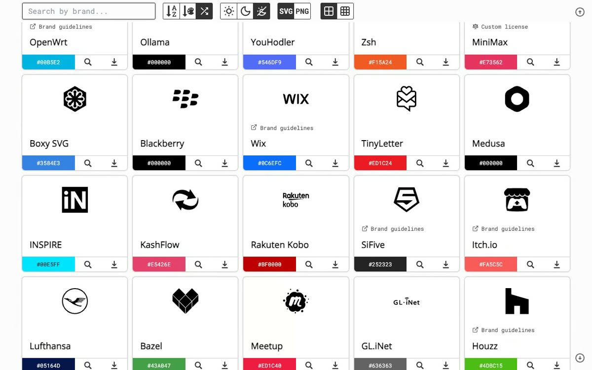 Simple IconsUI componentsBrand logos as SVG icons: browse, download one, or load it by slug from a CDN in the brand color.
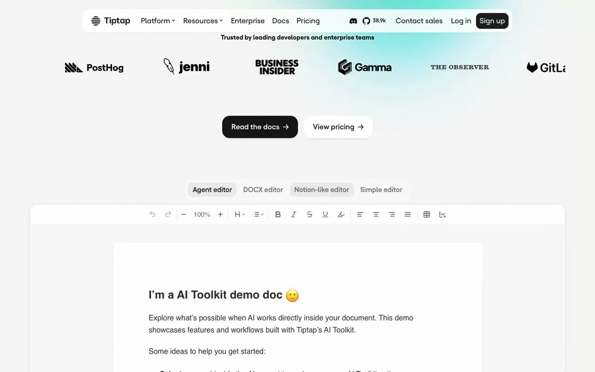 TiptapUI componentsA headless editor framework: build your own UI, add 100+ extensions, collaboration and comments.
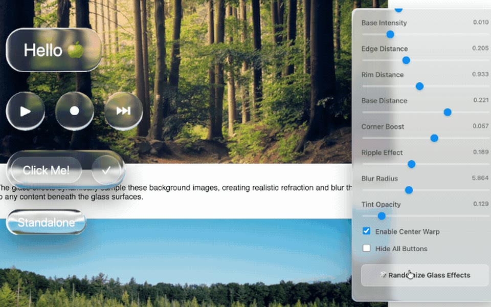 Liquid Glass JSUI componentsGlass buttons and panels that refract and blur the page behind them, with sliders for every setting.
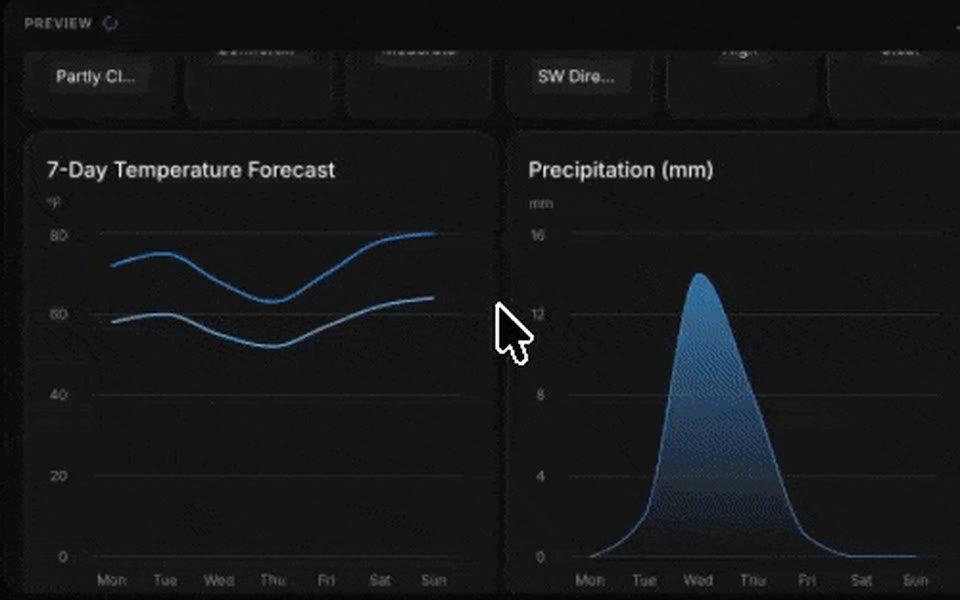 Open UIUI componentsAI answers rendered as real UI: a weather dashboard with cards, charts and a radar plot.
 OverflowUI componentsHand-drawn icons, illustrations and isometric drawings you drop into Figma with a free plugin.
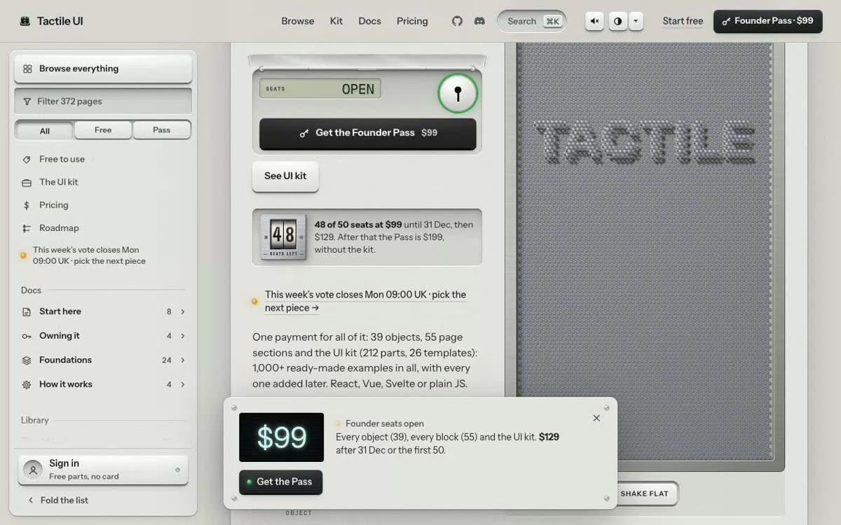 Tactile UIUI componentsSkeuomorphic buttons, dials and gauges you press and turn, like a physical control panel.
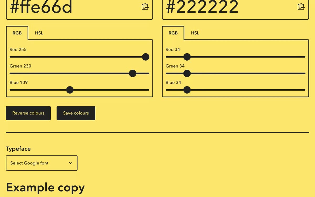 Colour Contrast CheckerUI componentsA big Aa preview with the contrast ratio and AA/AAA pass marks as you move RGB or HSL sliders.
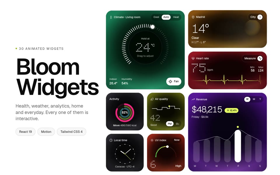 HorizonXUI componentsA catalog of UI kits, widgets and 3D assets, each with a Copy Prompt button to paste into your AI.
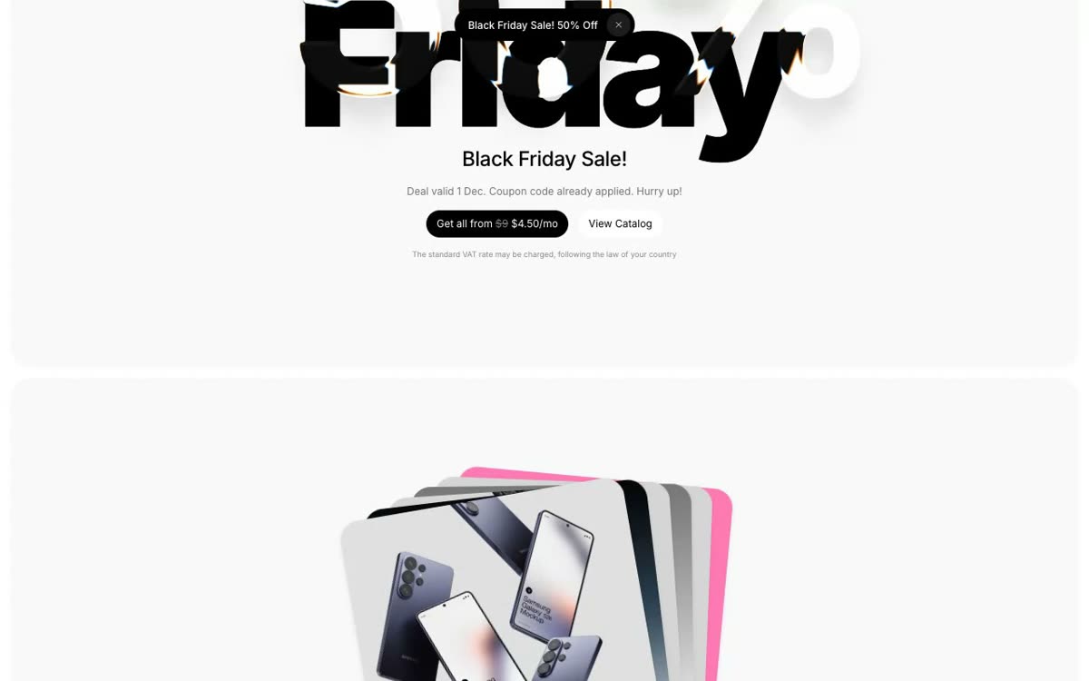 LS GraphicsUI componentsDevice mockups fanned out on a clean white page, plus an animated mockup editor.
 Mockup WorldUI componentsFree PSD mockups grouped by product: iPhone, MacBook, iPad, apparel, packaging and posters.
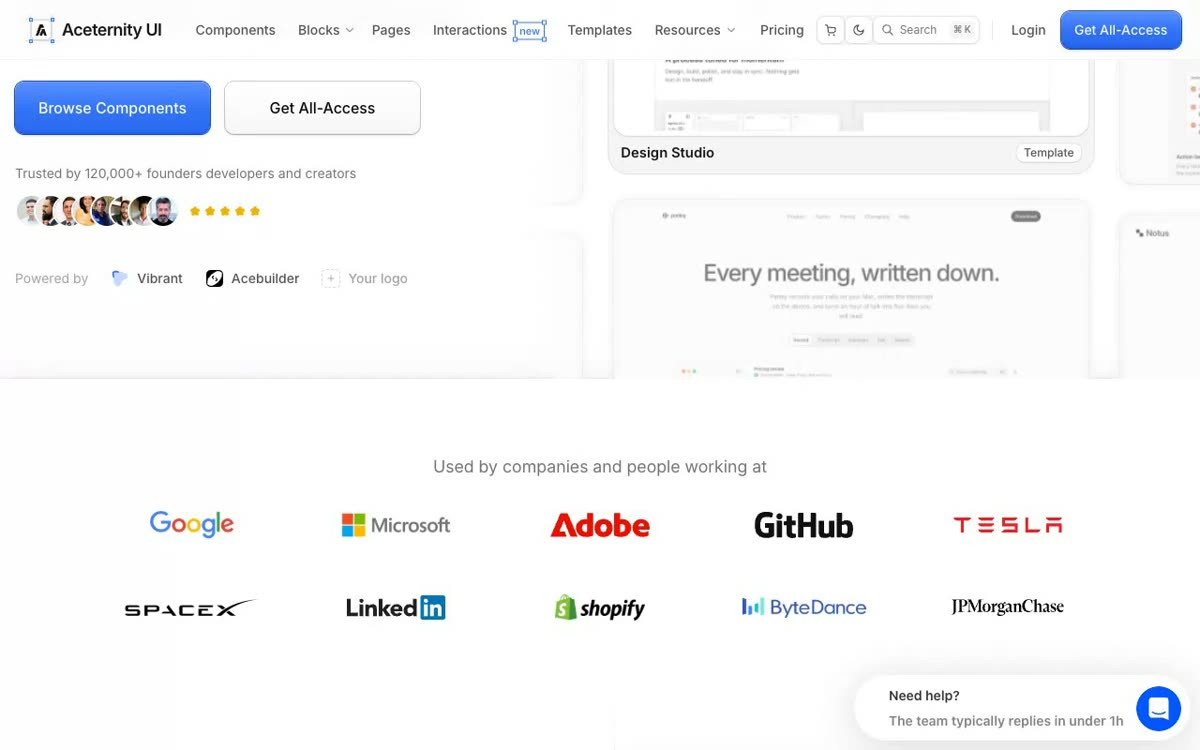 Aceternity UIUI componentsLanding page sections to paste in: animated heroes, cards, backgrounds and text effects in React.
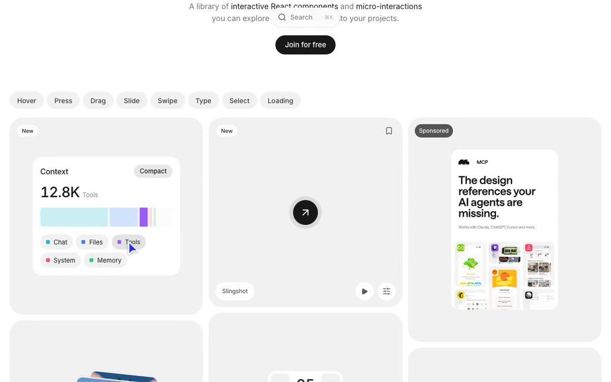 BenchoUI componentsAbout 160 microinteractions sorted by gesture: hover, press, drag, swipe, type and loops.
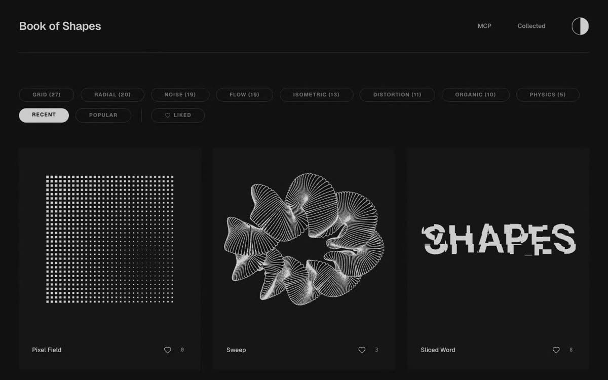 Book of ShapesUI componentsGenerative SVG patterns (pixel fields, woven grids, flow lines) you tweak and use as backgrounds.
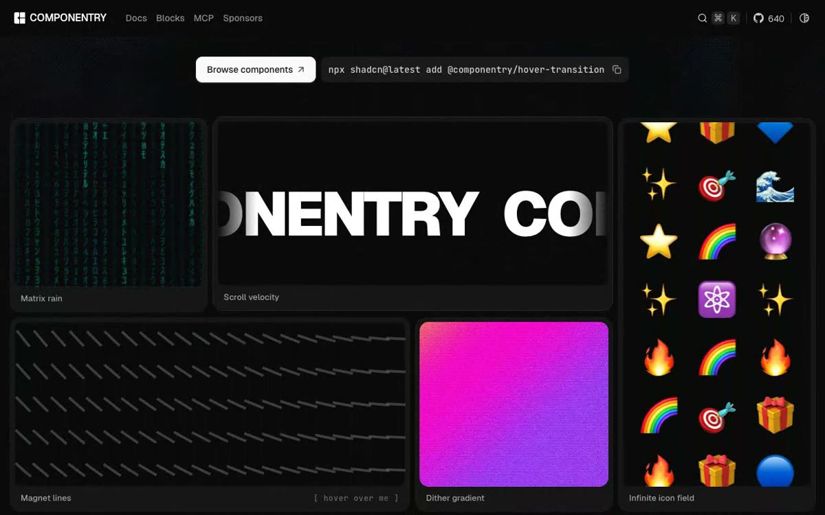 ComponentryUI componentsAnimated React pieces (magnetic dock, particle type, liquid WebGL) you add by CLI or MCP.
 FlowbiteUI componentsTailwind CSS components with dark mode and a matching Figma design system, under an MIT license.
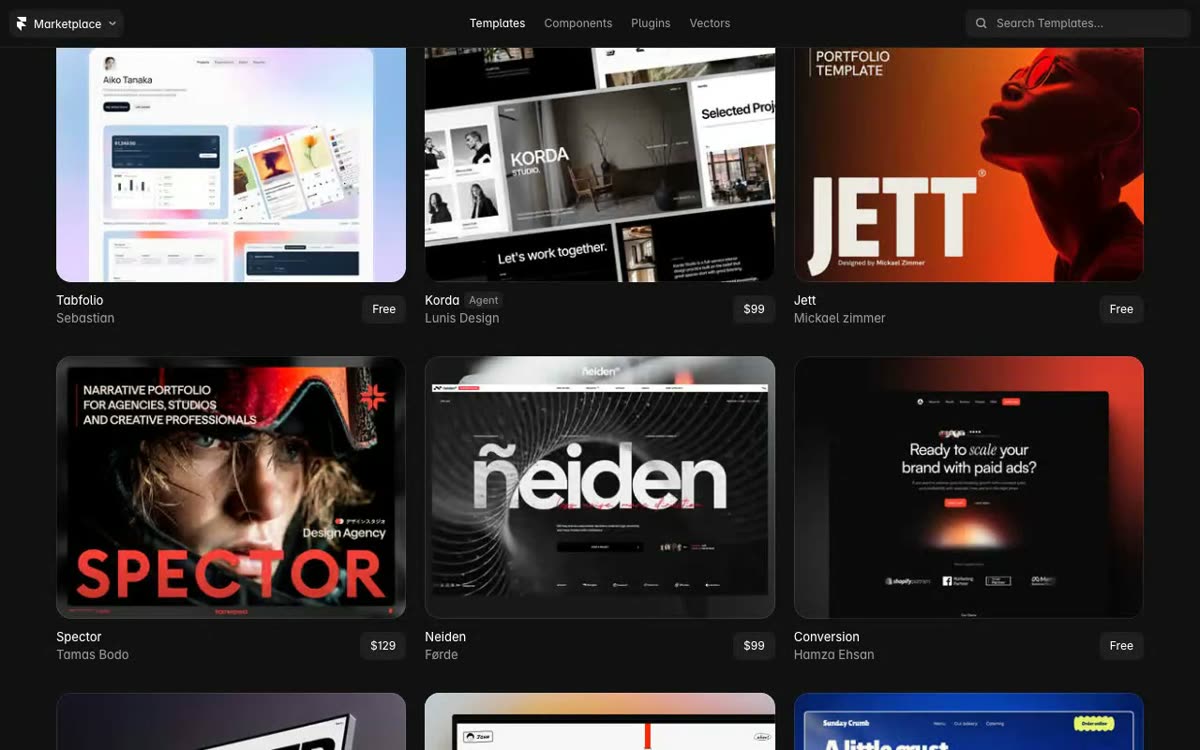 Framer Marketplace (templates e componentes)UI componentsFree Framer templates browsed by category, from dark editorial portfolios to agency layouts.
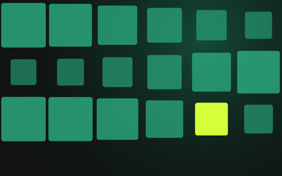 Hanging Card (Framer)UI componentsAny image turned into a card hanging on a rope that you drag around with bouncy motion.
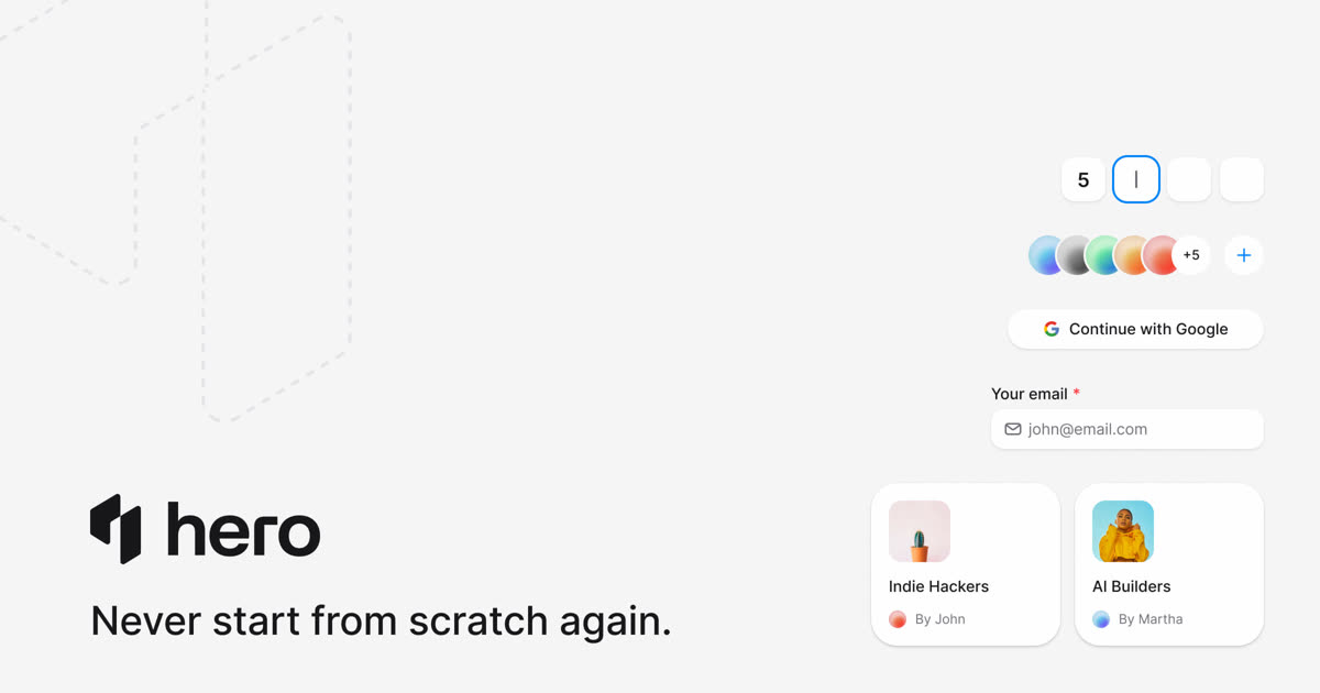 HeroUIUI componentsFree React components, plus premium templates and an embeddable agent that acts inside your product.
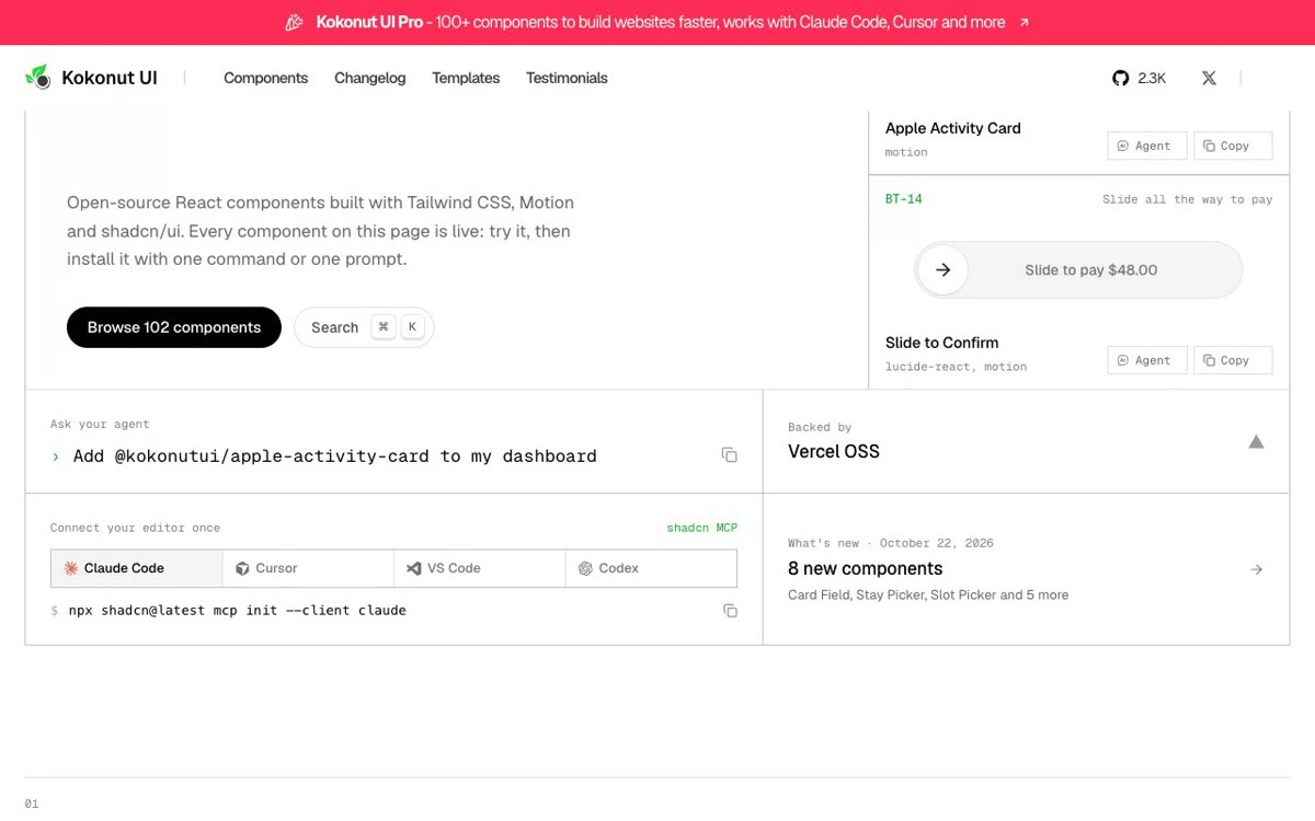 Kokonut UIUI componentsAnimated React components (activity rings, slide to confirm) that you add with one shadcn command.
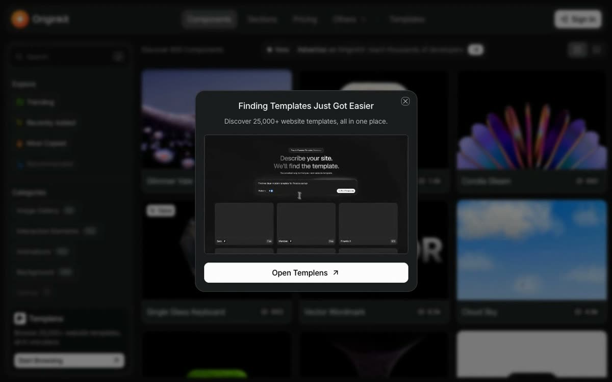 OriginKitUI componentsDescribe your site in a sentence and a search finds the matching template.
 PortaStudioUI componentsPortfolio template among six options; destination not confirmed
 ProseMirrorUI componentsA schema-driven toolkit for rich-text editors: collaborative editing, modular parts, your own UI.
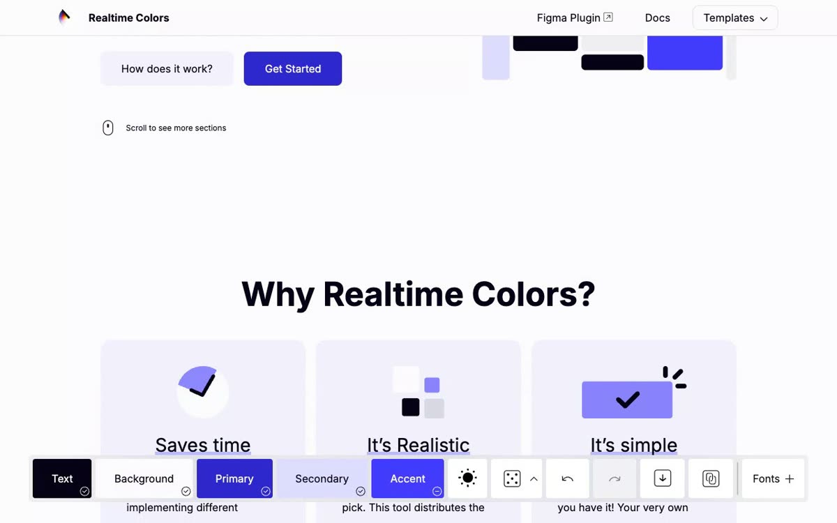 Realtime ColorsUI componentsA sample site that recolors live as you set text, background, primary, secondary and accent.
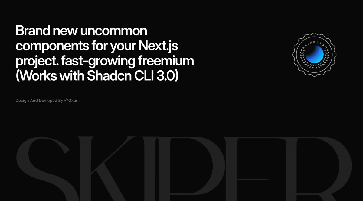 Skiper UIUI componentsUnusual animated components, like image reveal, dynamic island and cursor trail, installed by CLI.
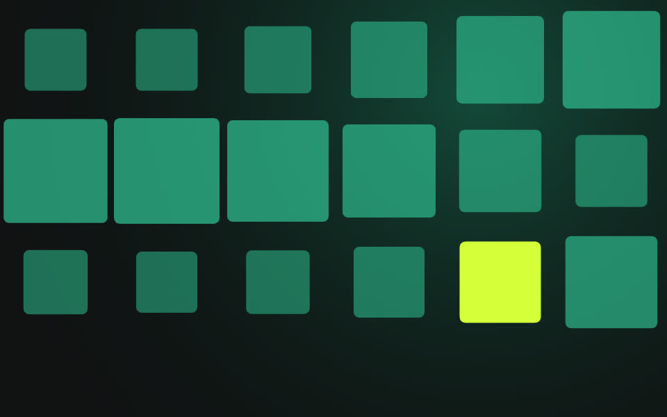 Smooth Image Trail (Framer)UI componentsImage stickers dropped along the cursor with random size and rotation, then faded out.
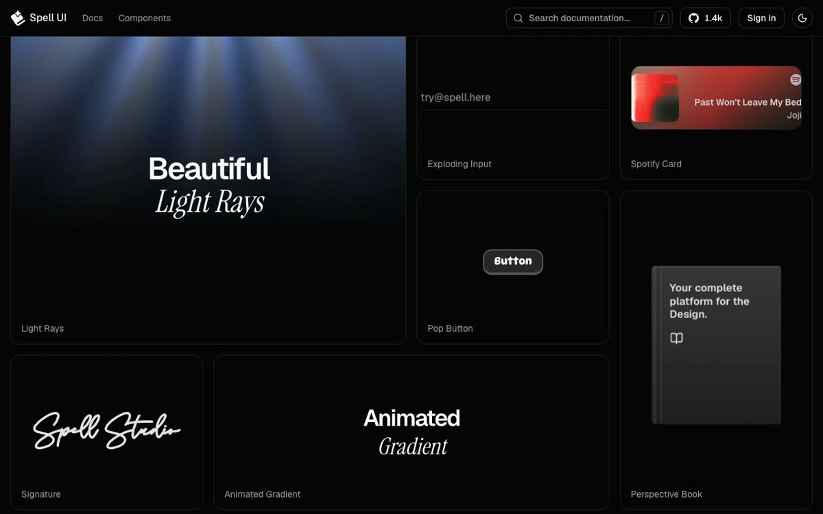 Spell UIUI componentsCopy-and-paste React pieces like light rays, an exploding input and a perspective book.
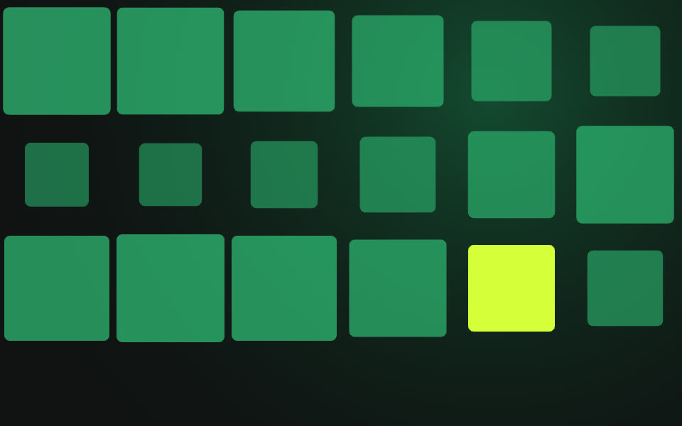 SpiralGallery Pro (Framer)UI componentsA 3D spiral of images you scroll through, drag to tilt and zoom, tuned from Framer's panel.
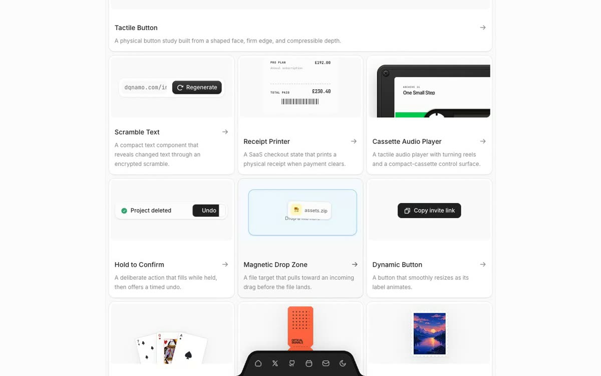 The KitchenUI componentsHold-to-confirm buttons, a cassette player and a receipt printer: UI details with a tactile feel.